In today’s competitive digital space, creating a beautiful landing page isn’t enough — it must be a high-converting landing page that drives real action. The secret? It lies in understanding the psychology of your audience. By tapping into human behavior, emotions, and decision-making patterns, you can design landing pages that not only attract attention but also inspire visitors to take the next step.
In this guide, we’ll break down the key psychological principles behind high-converting landing pages and how you can implement them to boost your conversion rates.
Why Psychology Matters in High-Converting Landing Pages
At its core, conversion is about influencing behavior. Every color, word, and layout choice triggers specific responses in your audience’s mind. A high-converting landing page uses psychological cues to build trust, reduce hesitation, and create urgency — all while making the action seem effortless.
Think of your landing page as a conversation with your ideal customer. The better you understand their motivations, fears, and desires, the easier it is to lead them toward your call to action.
1. First Impressions Matter: The Halo Effect
Studies show that users form an impression of your page within 0.05 seconds. This means your landing page design, colors, and headline instantly set the tone. A clean, professional design creates a halo effect, where the visitor’s positive impression of your design extends to their perception of your brand.
Tips to Apply:
Use a bold, clear headline that addresses the visitor’s main problem.
Maintain a simple, clutter-free layout.
Choose brand-consistent colors that align with your message.
2. The Power of Social Proof
One of the strongest psychological triggers in high-converting landing pages is social proof. Humans naturally look to others when making decisions. Testimonials, reviews, and case studies show that your product or service is trusted by real people.
Ways to Add Social Proof:
Display customer testimonials with names and photos.
Highlight the number of clients served or positive reviews received.
Add trust badges or logos of well-known clients.
3. Scarcity & Urgency: FOMO in Action
Fear of Missing Out (FOMO) is a powerful motivator. When people believe an offer is limited in time or quantity, they are more likely to act quickly. This is why countdown timers, “only X spots left” messages, and flash sales are common on high-converting landing pages.
Use phrases like “Offer ends tonight” to encourage immediate action.
4. The Rule of One
A mistake many landing pages make is offering too many choices. The Rule of One says that a high-converting landing page should focus on one audience, one offer, and one call to action. This reduces decision fatigue and makes it clear what action you want the visitor to take.
Implementation Tips:
Avoid adding multiple, unrelated CTAs.
Keep your messaging focused on a single goal.
Ensure every element supports your primary conversion action.
5. Color Psychology in Landing Pages
Colors aren’t just for aesthetics — they trigger emotions. For example, blue is associated with trust, red with urgency, and green with positivity. A high-converting landing page uses color strategically to guide users toward the CTA.
Best Practices:
Make your CTA button stand out with a contrasting color.
Use background colors that keep the focus on your message.
Align color choices with your brand’s personality.
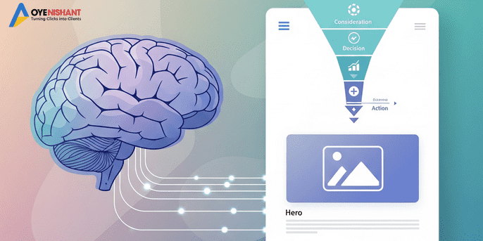
6. The Power of the Fold
Everything above the fold (the part of the page visible without scrolling) is prime real estate. For high-converting landing pages, this area should include your main headline, core benefits, and a prominent call to action.
Above the Fold Essentials:
Clear, benefit-driven headline.
Subheadline that supports your main promise.
A visible, clickable CTA button.
7. Persuasive Copywriting Techniques
Words can make or break a landing page. A high-converting landing page uses persuasive copywriting to connect emotionally and logically with the reader.
Copywriting Tips:
Focus on benefits, not just features.
Use power words like “proven,” “exclusive,” “guaranteed.”
Keep sentences short and easy to read.
8. Consistency Between Ads and Landing Pages
If your ad promises a free guide, your landing page should deliver that exact guide — not a different offer. Mismatched expectations can destroy trust. For high-converting landing pages, ad-to-page consistency is non-negotiable.
Ensure Consistency By:
Matching your ad headline to your landing page headline.
Keeping the same tone, style, and imagery.
Delivering exactly what was promised in the ad.
9. Mobile Optimization Is a Must
More than half of web traffic comes from mobile devices. A high-converting landing page must be fully mobile-responsive, with fast loading speeds and easy navigation.
Mobile Optimization Tips:
Use large, readable fonts.
Ensure buttons are thumb-friendly.
Keep forms short and simple.
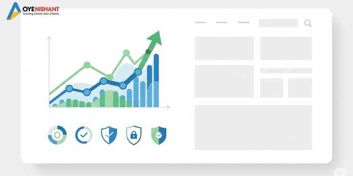
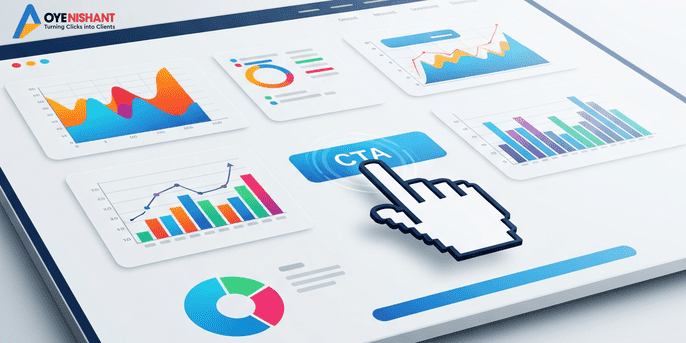
10. Test, Analyze, and Improve
Even the best-designed high-converting landing page can improve with data-driven testing. A/B testing helps you discover what truly resonates with your audience.
Things to Test:
Headline variations.
CTA button colors and text.
Placement of testimonials and social proof.
Conclusion: Turning Clicks into Conversions
Designing high-converting landing pages isn’t about guesswork — it’s about understanding human behavior and applying proven psychological triggers. From first impressions to scarcity, social proof to color psychology, every element plays a role in influencing your visitor’s decision.
By strategically combining these principles, you can transform your landing pages into powerful conversion machines that consistently drive results.
Pro Tip: If you want expert help creating high-converting landing pages tailored to your audience, Oye Nishant specializes in building data-driven designs that convert. Visit Oye Nishant’s website to learn more.